One of my goals for 2016 is to participate in more of PTI's monthly blog hops and weekly Make-It Mondays. I was rethinking this goal, however, when January's blog hop inspiration with its modern design and bold colors presented a challenge for me.
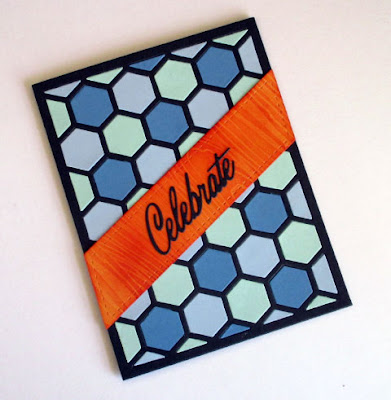
To incorporate the repetition of shapes of the inspiration photo, I turned to PTI's Hexagon Cover Plate die as a starting point.
I cut Smokey Shadow cardstock with the coverplate die and filled in with Blueberry Sky, Spring Rain, and Aqua Mist. The diagonal strip is Summer Sunrise cardstock cut with Lil Inkers On the Diagonal die. Then I impressed it with PTI's woodgrain impression plate and applied Terracotta Tile ink with a blending sponge. The sentiment is cut in Smokey Shadow from the Uncorked Words die set.
This bold graphic design is not my usual style, so my feelings about it are mixed.
This bold graphic design is not my usual style, so my feelings about it are mixed.


Very cool! :)
ReplyDeleteI think a lot of us were 'put off' by the bold colors and geometric design! love how you tackled it - love the colors on your background and the bold slash of sentiment strip!
ReplyDeleteWhat a sharp looking card! I love the hexagon design for your background and the bold diagonal orange strip looks fantastic.
ReplyDeleteI love this modern, graphic design! It really is my favourite kind of art though I can't actually do it myself :) I love the colour choices you made; the three blues are stunning together!
ReplyDeleteOh, I love your take on the inspiration photo!
ReplyDeleteLove the black outline for your colorful hexagon pieces!
ReplyDeleteI like your graphics and the color blues with the bright orange sentiment banner! Not really my style either, but you nailed the feel of the inspiration photo!
ReplyDeleteLove those hexagons!
ReplyDeleteReally, really love these hexagons, I need to use mine again. Thank you for the inspiration.
ReplyDeleteLove the inlaid background and the angled sentiment layer! Fabulously done!
ReplyDeleteLove your background and your bright orange banner is striking! Great card!
ReplyDeleteAwesome card Cammie. Love the colors and the honeycomb background! Great graphic take on the photo.
ReplyDeleteA perfect take on the inspiration photo Cammie...love it!! :0)
ReplyDeleteFor someone who doesn't do bold and graphic, you sure did a fabulous job on this one! Nicely done Cammie!
ReplyDeleteWell your off to a good start Cammie, you did all of the Papertrey Ink hops so far this year :)
ReplyDeleteI love your card design ,what a fun take from the photo. This started out as a hard one for me.
I love the bold graphics of your card.
ReplyDelete