Friday, June 25, 2010

PTI Blog Hop--COLOR

AQUA MIST, CREAM, TERRACOTTA TILE


Hi! Welcome my stop on the hop that focuses on color this month.

When I awoke this morning, I decided to make another card for this hop, even though I had my post already to go.

As I set out on card number two for the hop,I had several goals in mind
1. Use a  color I use infrequently--Terracotta Tile
2. Use a stamp I use infrequently--Beautiful Blooms One
3. Use a current sketch challenge--Clean and Simple Sketch 96
4. Make the overall look of the card light while using Terracotta Tile

Searching through my inspiration notebook, I came across these photos of these slipcovered chairs and stools which loosely became my inspiration.


I love this beach cottage!
But I digress, on to my card.

As I gathered materials, I realized I don't own Terracotta Tile ink; I only have the cardstock.  So I used Versacraft Autumn Leaves ink which is a fairly close match to Terracotta Tile cardstock. I started with a card base of Aqua Mist. I stamped a piece of Rustic Cream cardstock and adhered it. The Aqua Mist piece, matted on Terracotta Tile, is stamped with a bloom from Beautiful Blooms and a fern  frond from Turning a New Leaf. The sentiment is from the latest anniversary set, Round and Round. A little twine and button are the simple  finishing touches.

Each month the blog hop provides so much inspiration. A huge thank you to everyone who participates!

Supplies:
Stamps: Beautiful Blooms One, Turning a New Leaf, Background Basics:Botanicals, Round and Round (PTI)
Ink: Vintage Cream, Aqua Mist (PTI); Autumn Leaves (Versacraft)
Paper: Aqua Mist, Rustic Cream, Terracotto Tile (PTI)
Other: Rustic Jute Button Twine, Aqua Mist Vintage Buttons (PTI)

Monday, June 21, 2010

Papertrey Peeps Challenge #10

Happy official first day of summer! It's a sunny, hot day here, but at least the humidity is low.

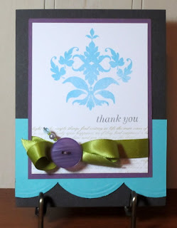
There is new challenge, hosted by Heather, posted on the Papertrey Peeps Blog. Heather, known for her great use of color,  is challenging us to use these colors: turquoise, chartreuse, purple, gray and white. I started on my card Saturday morning after reading Heather's challenge; however, I had short term memory loss and forgot the color purple until the card was almost put together.
I used a card by Jessica Witty in  Card Creations Vol. 8 as my inspiration.
I began with a card base of Smokey Shadow and then added the large scalloped piece in turquoise. I stamped the large fleur de lis in Hawaiian Shores, the sentiment in Smokey Shadow, and the text at the bottom in Simply Chartreuse. I planned on using the chartreuse ribbon with a turquoise button. . As I was thinking I wish I had some chartreuse cs as a matte, I had the epiphany that there was another color in this challenge: purple, so I made the matte purple and added a bold purple button. The final touch is a more delicate beaded pin with a lavender pearl and turquoise and green gems.
A peek inside

Thanks, Heather, for a great challenge.

Supplies:
Stamps: Damask Design, Inside and Out: Thank You, Background Basics: Text Style,Simply Stationery(PTI)
Ink: Smokey Shadow, Simply Chartreuse,Hawaiian Shores(PTI)
Paper: Smokey Shadow, Hawaiian Shores, Plum Pudding, Stamper's Select White (PTI)
Other: Border punch(EK Success), Simply Chartreuse satin ribbon, Plum Pudding Vintage Button (PTI)

Friday, June 18, 2010

Summer Fun

I found some time to play along with  this week's The Shabby Tea Room Challenge--summer fun. I've had this sweet image of children playing from Vintage Printable printed for awhile, and I thought it would be perfect for this challenge.

I started with  an Aqua Mist (PTI) card base. I stitched a strip of dotted paper from Webster's Pages  to a piece of Road Show (Fancy Pants) paper, which I'm loving. (Why did I only buy one sheet?)   I cut the image with Spellbinders deckled rectangle die and mounted it on a doily that I  lightly aged with Antique Linen Distress Ink. I die cut the scalloped circle and covered with  Martha Stewart glitter. The small die cut label is stamped with "summer" from Flourishes Wreaths of All Seasons stamp set and is anchored with an Aqua Mist button (PTI). The seam binding  ribbon is from Deb's Simple Treasures Etsy Shop which happens to be the sponsor of this week's challenge. A flower, pearl, and  Jenni Bowlin stick pin complete the card.

Wishing you some summer fun this weekend,

Wednesday, June 16, 2010

You Are So Sweet

Hi everyone! How's the weather in your neck of the woods as Al Roker says on the Today show? Here it has been hot and  suffocatingly humid-- more like our July and August weather--weather where two minutes outside leave you "dewey"--a Southern woman's way of saying "sweating profusely".  While I much prefer being outside than in an air conditioned room, that just hasn't been the case, the last few days, so I've been inside enjoying the AC while getting crafty.  I made a card using this week's sketch at CPS.


Using  A Child's Year Cricut Cartridge, I cut the ice cream cones in different colors and then paper pieced. I stamped the kraft cone with the small diamonds from A Little Argyle with Versarmark. A cherry gem tops each cone. 
Gee, I wonder why those diamonds made me think of cool, cool  ice cream cones?

Stay cool and thanks for stopping by,

Supplies:
Stamps: Say It With Style, A Little Argyle (PTI)
Ink: Rich Cocoa (Memento),Versamark
Paper: Kraft, Vintage Cream, Sweet Blush, Dark Chocolate, Pretty Pastels(PTI)
Other: Cricut, gems

Tuesday, June 15, 2010

Waltzingmouse Sketch Challenge 2

Hello! Such a simple sentiment, but that simple sentiment  on a handmade card mailed to someone is a wonderful way to brighten a day. My card today uses the sketch found at Waltzingmouse Sketch Challenge
Here is the current sketch.


And my take on the sketch.

I stamped Labels 4 in Ripe Avocado. Then I stamped the geraniums in the set From the Garden. After masking the flowers, I stamped the pot. I colored the geraniums with these Copics. R22, R24, R29,YG93,YG95,YG97. I colored the pot with Prismacolor pencils.Then added some shading of the image with C1. The sentiment from Mega Mixed Messages is stamped in Ripe Avocado on an oval die cut with an inked edge.

Thanks for stopping by,

Supplies:
Stamps: Labels 4 (Waltzingmouse Stamps), From the Garden (Flourishes), Mega Mixed Messages (PTI)
Ink: Ripe Avocado(PTI), Black Tuxedo(Memento)
Paper: Vintage Cream(PTI), Road Show(Fancy Pants)
Other: Nestabilities (Spellbinders),  Berry Sorbet Vintage Buttons (PTI)

Monday, June 14, 2010

FTTC 70

Dee Jackson,the host this week at Flourishes Timeless Tuesday Challenge, has issued the challenge to use black and white with a third color of choice. I knew immediately I wanted to use my recently purchased   Flourishes Lace Edges set. Initially, I had something completely different in mind for a card, but I was at Target and saw some thank you cards with an ornate border and a clean sentiment. So I made a set of single layer thank you cards.
I like the modern twist of these elegant laces in these colors.


Supplies:
Stamps: Lace Edges(Flourishes), Thank You: Inside and Out (PTI)
Ink: Raspberry Fizz, Hawaiian Shores,Melon Berry (PTI);New Sprout, Black Tuxedo (Memento)

Saturday, June 12, 2010

Papertrey Peeps Challenge #9

Over on the Papertrey Peeps Blog, Linda is challenging us to think about summer travel and vacation.  With this fun challenge, I gave my PTI set Up, Up and Away its initial inking. Although my summer travel plans don't include balloon travel, I love seeing hot air balloons sailing peacefully against a blue sky.

I just received the latest issue of PaperCrafts, where there is a shaped card by Betsy Veldman like one in this post. Using Betsy's card as inpsiration, I used Label 8 Nestabilities to die cut my card. 

I used two layers for the front piece. Then after sewing the front to the back of the card base, I added another layer to the back, to hide the "uglier"  side of my stitching. Usisng two layers also means that all sides of the card base show the "good" side of the die cut. I used some lighter weight ( cheaper) white cardstock since there were two layers. After cutting the blue piece I ran it through the Cuttle bug with PTI's canvas impression plate. I inked the edges of the cloud, and those balloons---so much fun to color.  In fact I rate coloring them right up there with coloring the dahlias from Delight Dahlia. And think of all the coloring options you have!
No soaring in the sky for me today,  I will be close to the ground. Work in the back yard is necessary. My plants have had a real growing spurt and must be trimmed to find the stone path. I mean I love a lush garden, but one does need to be able walk through it without a machete in hand. And with humidity this morning at about 200%, it does feel like a jungle.

 Have a good weekend!


Supplies:
Stamps: Up, Up and Away; sentiment from Everyday Button Bits (PTI)
Ink: Black Tuxedo, London Fog (Memento)
Paper: Spring Rain (PTI), Dear Lizzy Spring Dragon Fly Dance (American Crafts), Georgia Pacific
Other: Copics Y13, Y15, B41, B45, RV32, RV34, G21,G24, R22, R24, E25,E29,E43; Rustic Cream Twine(PTI), button(Paper Studio), balloon and cloud dies (PTI)

Thursday, June 10, 2010

Card Pattern Sketch 67

Hi all. This is a quick post with a card using this sketch from Card Patterns.


And my card using Vintage Picnic, one of my favorite PTI stamps.

  I stamped the sentiment from Every Day Button Bits and flowers on a deckled rectangle die cut. I  stamped, colored ,cut the picnic basket and then attached it with dimensional tape.  The pink strips are stamped with Polka Dot Basics 1 in Versamark. The flower embellishments are die cut and colored with a Copic. I used a black pen to make the petals more pronounced. Brown buttons finish the flowers which are placed on some green polka dot ribbon.

I'm off to the kitchen to start dinner.


Supplies:
Stamps:Vintage Picnic, Every Day Button Bits, Polka Dot Basics 1(PTI)
Ink: Black Tuxedo (Memento)
Paper: Stamper's Select White, Hibiscus Burst, New Leaf(PTI), Pretty Plaid (Jenni Bowlin)
Other: Deckled Rectangle Nestabilities, Flower Dies (Cuttlebug), Copics, Buttons, Ribbon

Sunday, June 6, 2010

Sunshine and Blue Skies Challenge, FLLCJUN10

As Flourishes  readies to unveil new stamps this week, this great stamp company is hosting a color challenge--Sunshine and Blue Skies.  Create a card using any combination of blue and yellow, and you have a chance to win the entire June release!
The paper, the butterfly, and the sentiment are just right for this  fanciful summery card.


1.Make an A2 card base from Smokey Shadow cardstock.
2. Cut 3 strips of patterned paper and sew onto a piece of Lemon Tart cardstock.
3. Die cut label and stamp sentiment from Pure Poppy stamp set with London Fog ink. Thread with  lace trim and attach to piece.
4. Attach piece to card base.
5. Stamp butterfly from Fanciful Flourishes with blue ink on Lemon Tart cs,cut out, attach with dimension tape.  Place tape only in the middle of butterfly and gently lift wings.

Do you think the bird is calling out a warning about the giant mutant butterfly?


Supplies:
Stamps: Poppy Patch, Fanciful Flourishes (Flourishes)
Ink: Peacock pigment ink(Colorbox), London Fog(Memento)
Paper:  Vintage Cream, Lemon Tart, Smokey Shadow(PTI), Petite Papers-Seaside Retreat, Garden Gala, Nature's Storybook(Webster's Pages)
Other: Ribbon Labels Trio 2 (Spellbinders), Lace trim (Prima Marketing)

Saturday, June 5, 2010

Embellish Magazine Challenge

Hi everyone!  I have a card for the latest Embellish Magazine Challenge

While I have several Waltzingmouse Stamps on my wish list, currently the ones I own are those that coordinate with Nestabilities. I love Nestabilities, and Claire's stamps add beautiful details to those die cuts!

I began this card yesterday morning . Later in the day after I saw Betsy Veldman's felt roses, my decision for emblishments was made! These rose are not at difficult to make.  I'm not sure about the brown leaves, but I wanted to stick with the challenge colors.
Steps:
1. Cut cream cs for A2 card base.
2. Cut yellow cs and stamp.
3. Cut a piece of cream cs and stamp. Stitch to yellow panel.
4. Attach yellow panel to card base.
5. Die cut and emboss Fair Isle Pendant in Berry Sorbet.
6. Die cut circle in cream. Stamp label image and sentiment. Attach to pendant die cut.
7. Attach pendant to card.
8. Attach felt flowers and leaves

Have a great weekend!

Supplies:
Stamps: Vintage Circles Small (Waltzingmouse Stamps), Background Botanicals (PTI), Anytime Messages(Hero Arts)
Ink: Berry Sorbet (PTI), Rich Cocoa (Memento)
Paper: Rustic Cream, Lemon Tart, Berry Sorbert
Other: Circle Nestabilities, Fair Isle Pendant(Spellbinders); Cream felt(PTI; brown felt(Hobby Lobby)

Friday, June 4, 2010

Live the Sweet Life, FTTC69

This week's host of Flourishes Timeless Tuesday Challenge, Barbara Anders, is challenging us to make a single layer card.

After masking the top and bottom portion of the card, I stamped the medium cherry image from Peaches and Cherries. Then using my Score Pal, I embossed the edges of  the stamped section and added a second embossed line on the top and bottom.  I added a sentiment, ribbon, and button tied with twine. 

Hope your day is sweet!

Supplies:
Stamps: Peaches and Cherries(Flourishes)
Ink: Pure Poppy (PTI)
Other: Pure Poppy Vintage Button (PTI), ribbon (Hobby Lobby), twine(Martha Stewart)

Thursday, June 3, 2010

Less is More

 This is true. A clear concise thought is more powerful than a verbose statement. And a CAS card often makes a stronger impression than one with many layers and embellishments.  Not that I favor one over the other. It depends on what mood I am in. I mean I am a Gemini with that dual nature and attraction to opposites.  I have been intrigued with cards that are white on white with the only color coming with the focal point. I thought the latest Just Us Girls challenge to use dry embossing would be a great time to use this plan. I pulled out some of my metal stencils, light box, and stylus along with an impression plate.

I used PTI's Linen Impression plate on the upper portion  of a 5 1/4x 4 piece of card stock. (You may need to enlarge the photo to better see the texture.) Using the light box and stylus, I embossed the focal point on the bottom portion. Remember, running a piece of waxed paper over the cardstock, makes it easier to emboss with the stylus.

The focal point is a metal stencil from a local company, Country Stencils.  This company has some lovely designs. If you are a quilter and attend quilting shows, you may  see a Country Stencils booth; if so, be sure to stop and check out their products. Of course you can also order online.
After embossing, I stenciled the image using Lavender Moon dye ink and Spring Moss pigment ink. Use stiff bristled brushes and blot brush on a paper towel, so that the brush is fairly dry before stenciling.
Next I added  the rick rack border which I ran through the Cuttlebug with the impression plate after I cut it with PTI's rick rack die.  Finally, I attached the panel to the card base.
I like the light summery mood of this card.
Thanks for stopping by,

Tuesday, June 1, 2010

Little Sweet Pea

I am beginning to catch up on the Papertrey Peeps challenges--one down, two to go. All three are great challenges, so I don't know why I've been such a slug-a-bug. Lori's challenge here is to use red and green without a Christmas theme. I went to Baby Button Bits and the sweet pea image and to Cosmo Cricket's
Garden Variety Mini Deck for my card.

Steps:
1. Cut A2 card base in Vintage Cream.
2. Stamp bottom portion of card base with Polka Dot Basics 1 in Simply Chartreuse.
3. Cut patterned paper.
4. Cut border trim. Attach to patterned paper.
5. Attach patterned  paper  and trim to card base.
6. Cut scalloped oval and attach.
7. Stamp pea image in Simply Chartreuse ,cut, and attach to scalloped oval with dimensional tape.
8. Thread buttons with embroidery thread and attach.
9. Stamp sentiment in New Leaf ink. (The sentiment showed up much better on the dots when I tried it on scratch paper. It's so frustrating when my stamping works better in practice)

Note: I am having a lot trouble getting a good color with the Simply Chartreuse ink. I have the cube which is very moist; I've stored it face down; I used the spoon-smooshing technique, and I've stamped many times,
and the ink still has a very grey tint to it. Any other suggestions?

Finally, congratulations to Lori McAree the host of this challenge who is  the featured stamper in June's PTI Newsletter.


Supplies:
Stamps:Baby Button Bits (PTI)
Ink: Simply Chartreuse, New Leaf (PTI)
Paper: Pure Poppy, Vintage Cream(PTI), Garden Variety Mini Deck(Cosmo Cricket)
Other: New Leaf Vintage Buttons (PTI), Scalloped Oval Nestabilities (Spellbinders), Apron Lace border punch (Fiskars)